my_plot <- ggplot(...) + geom_...(...)
my_plot

# Try something new
my_plot + ...

# Keep the change
my_plot <- my_plot + ...
my_plotTask 2: Beautify and save plots
Find the solution here after the session ends.
Getting started
Take one of the plots you made in Task 1 and improve it step by step.
First, save the plot in a variable so you can build on it without rewriting the whole plot each time:
I don’t have a working plot from Task 1 (unfold to get a starting plot)
Copy and paste this code to get a starting plot:
library(tidyverse)

ggplot(
  penguins,
  aes(x = bill_len, y = bill_dep, color = species, shape = species)
) +
  geom_point()
Add labels
Use labs() to give your plot a title and proper axis labels. Also change the legend title so it doesn’t just show the variable name.
Change the colors
Change the colors of your plot. You can either:
- Pick your own colors with
scale_color_manual(). Refer to colors by name (e.g."red","cyan4") or by hex code (e.g."#FF0000"). You can find hex codes with this color picker and all R color names here. - Use a built-in palette with
scale_color_brewer()orscale_color_viridis_d().
Color vs. Fill
If your plot uses fill (e.g. boxplots, histograms), you need scale_fill_manual() or scale_fill_brewer() instead of the scale_color_* versions.
Apply a theme
Try a few different themes (e.g. theme_minimal(), theme_classic(), theme_bw()) and pick one you like.
Reproduce this plot
Try to reproduce the following plot. It builds on the scatterplot from Task 1:
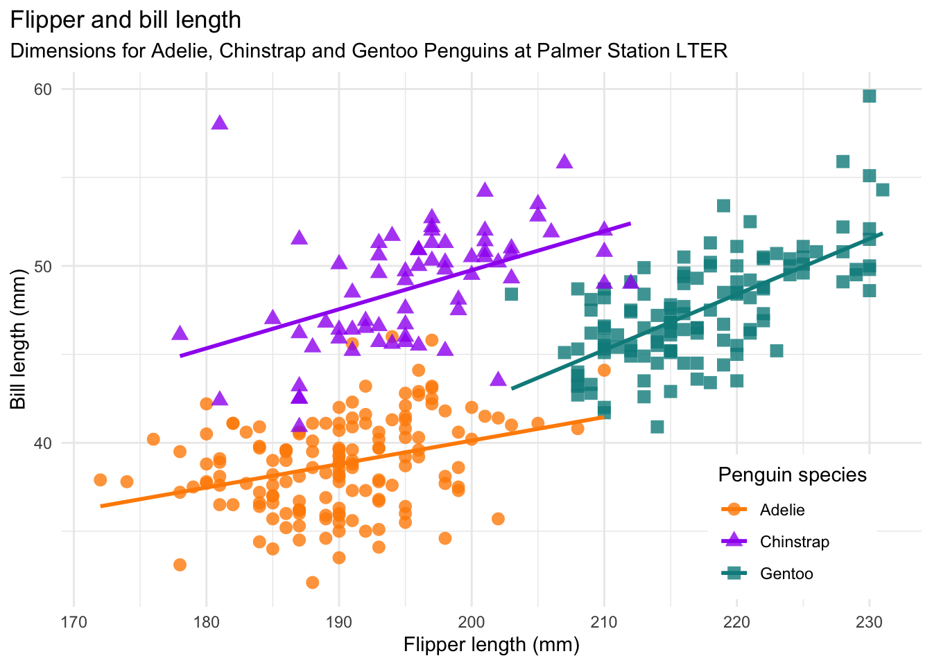
Hint: the colors used are:
penguin_cols <- c("darkorange", "purple", "cyan4")Save your plot
Take one of your plots and save it to your project as a .png file.
- Make sure you have an
img/folder in your project (create it in the Files pane if needed) - Use
ggsave()to save your plot as a.pngfile in theimg/folder. Check?ggsaveor the slides if you’re not sure about the arguments. - Check the Files pane to find the png file.
For the fast ones
You can do these in any order, or skip them and just take a break.
Fine-tune the theme
Use theme() to customize individual elements of your plot, for example the legend position or the font style of the title. To find out what you can customize:
- Check
?theme - Search online “ggplot theme …” for specific ideas
- Have a look at the theme reference sheet on the slides
Change point appearance
Try setting fixed aesthetics inside geom_point() to change the look of all points, for example their size, transparency (alpha), or shape.
Save in different formats and sizes
Try saving your plot as a .pdf and with custom dimensions using width and height in ggsave().
Make a plot with your own data
If you have your own data loaded in R, try making a plot with it and beautifying it.
References
Horst AM, Hill AP, Gorman KB (2020). palmerpenguins: Palmer Archipelago (Antarctica) penguin data. R package version 0.1.0. https://allisonhorst.github.io/palmerpenguins/. doi: 10.5281/zenodo.3960218.