Task 1: Exploratory plots with ggplot2
Find the solution here after the session ends.
Getting started
A helpful resource for this task is the ggplot2 cheatsheet.
Remember to put library(tidyverse) (or library(ggplot2)) on top of your script.
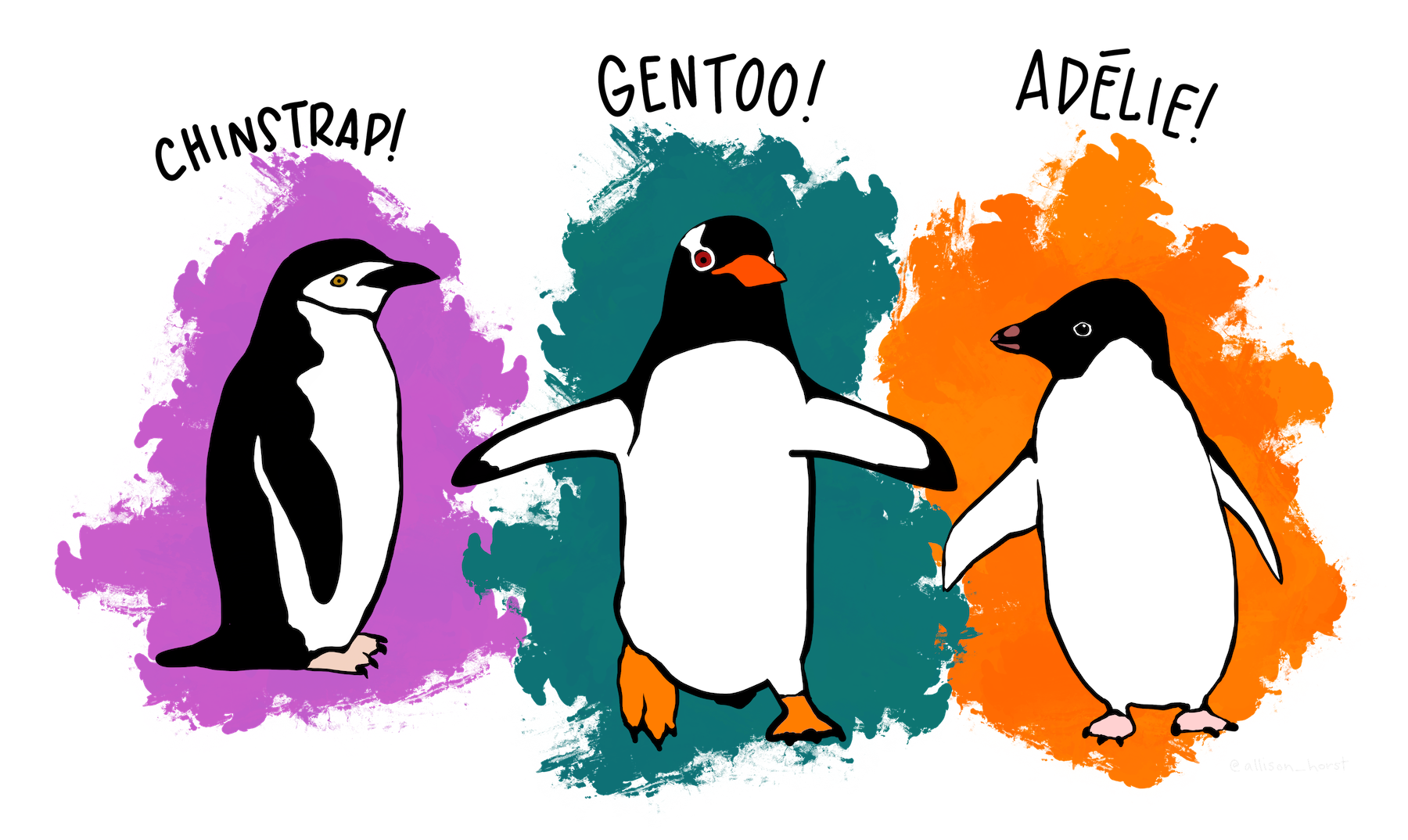
We will use a data set on 3 species of penguins on islands in Antarctica.
The data is available in R and the data set is called penguins:
- Type
penguinsin the console to see the data - Check
?penguinsfor a description of the variables
Take a moment to get familiar with the data set.
Remember the basic ggplot structure:
ggplot(data, aes(x = ..., y = ...)) +
  geom_xxx()
Exploratory plots
Explore the data set and its variables using ggplot. Below are some suggestions for plots. Pick the ones you find most interesting, and feel free to try your own ideas too.
Don’t worry about making the plots pretty yet. We’ll do that in Task 2.
Bill length vs. bill depth (scatterplot)
- Create a scatterplot with bill length on the x-axis and bill depth on the y-axis
- Add a regression line
- Add species as color aesthetic. Does your interpretation of the data change?
- Add species as shape aesthetic to distinguish the species
Flipper length by species (boxplot)
- Create a boxplot of flipper length (y-axis) for the different species (x-axis)
Body mass by sex and species (boxplot)
- Create a boxplot with body mass on the y-axis and sex on the x-axis
- Add species to the plot. Try the different options ggplot offers:
- Species as color aesthetic
- Species as fill aesthetic
- Species as facet using
facet_wrap(vars(species))
Flipper length distribution by species (histogram)
- Make a histogram of the flipper length separated by species
- Try different methods of separating the species (color or facet)
- Compare stacked and overlapping histograms
Add facets
Take one of the plots you made above and split it into panels using facet_wrap(), e.g.:
facet_wrap(vars(species))Try splitting by different variables like species, island, or sex.
For the fast ones
You can do these in any order, or skip them and just take a break.
Combine points and boxplots
Add a geom_point() layer on top of your boxplot. What does this show you that the boxplot alone doesn’t?
Overlapping points
Try adding position = position_jitter(width = 0.2) inside geom_point() to spread the points out so they don’t overlap.
Try violin plots
What happens if you use geom_violin() instead of geom_boxplot()? Can you combine both geoms in one plot?
Create a heatmap
Create a heat map with sex and species on the axes and flipper length as the fill color.
Try with your own data
If you loaded your own data into R last session, try making a plot with it.
References
Horst AM, Hill AP, Gorman KB (2020). palmerpenguins: Palmer Archipelago (Antarctica) penguin data. R package version 0.1.0. https://allisonhorst.github.io/palmerpenguins/. doi: 10.5281/zenodo.3960218.