Clear figures,
stronger stories
Scientific workflows: Tools and Tips 🛠️
2025-04-17
Motivation
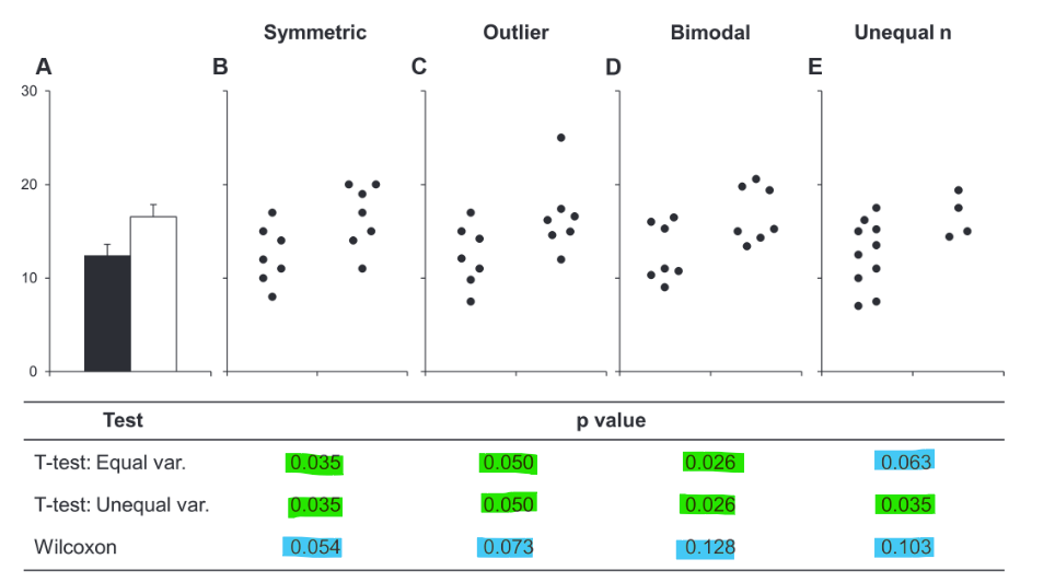
Don’t hide data behind summaries

Don’t hide data behind summaries
Bar graphs hide a lot of information about the data.
Don’t hide data behind summaries
Same bar plot - different data & statistical test results
Alternatives to bar plots
Bar plots only show mean ± SE/SD.

Alternatives to bar plots
A box plot is already better (shows more of the distribution)

Alternatives to bar plots
A box plot is already better (shows more of the distribution)
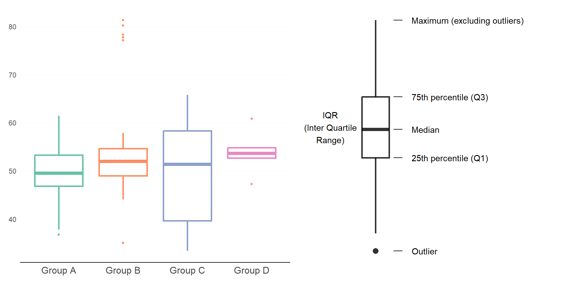
Alternatives to bar plots
Add raw data points to increase the information content of the plot

Alternatives to bar plots
Raincloud plots show raw data, summary stats, and distribution

Principle of proportional ink
Sizes of shaded areas should be proportional to the data values they represent

Here: bar length does not represent relative data proportions anymore
Always start bars at 0!
Principle of proportional ink
Other plot types don’t have to start at 0.

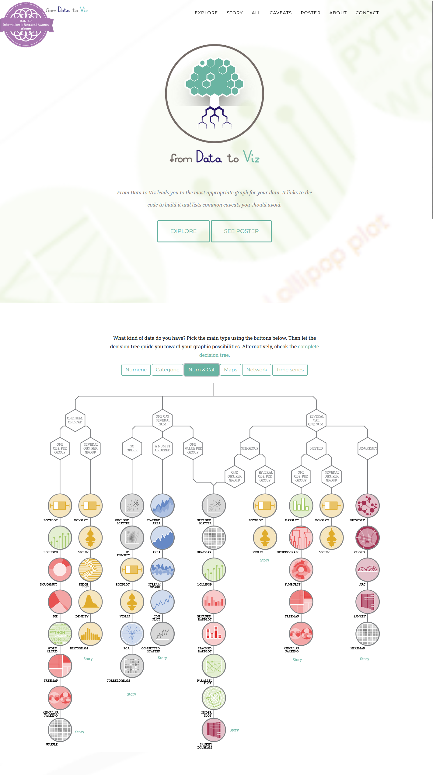
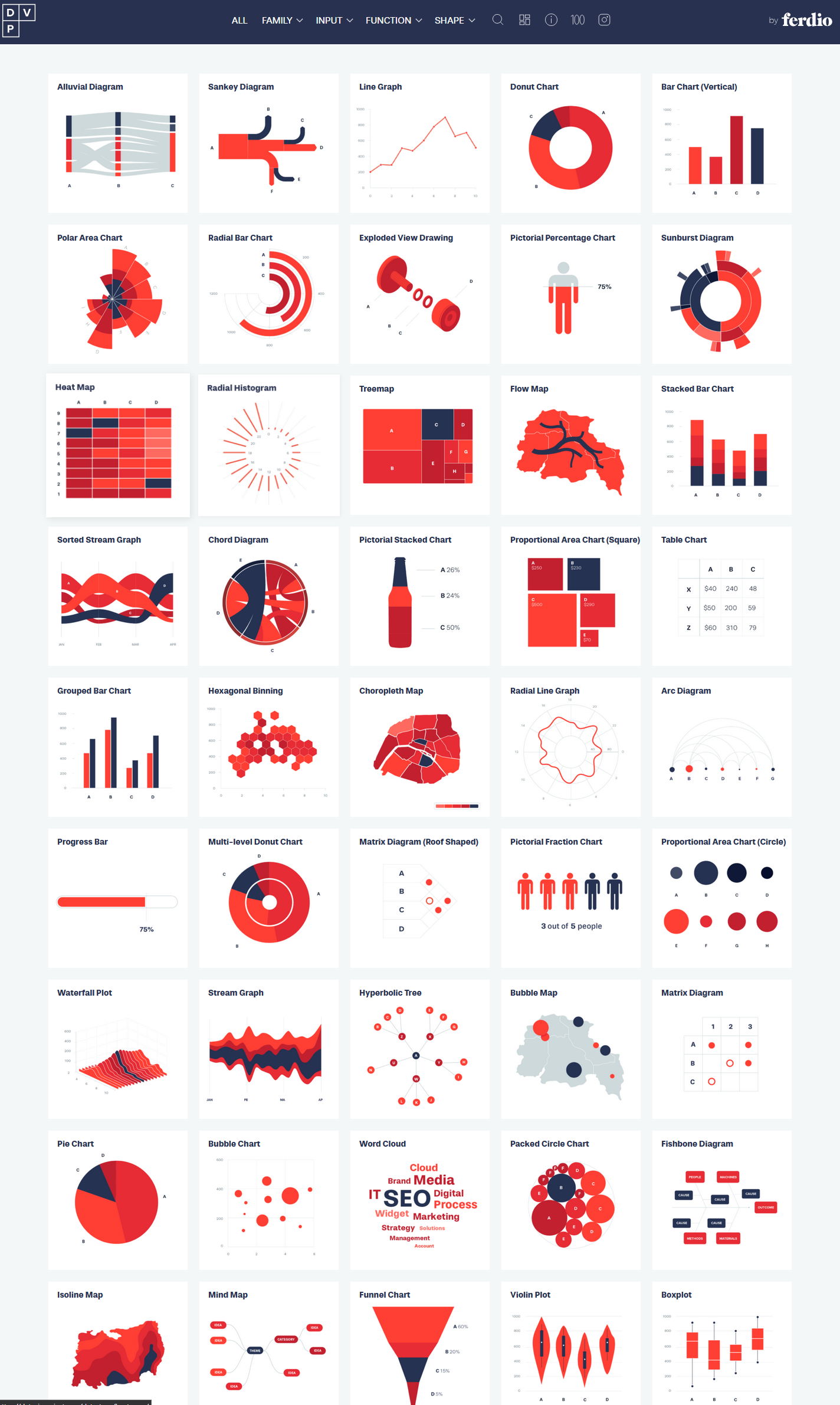
Choose the right chart type
There are so many chart types - and cool tools to explore them
Different channels - different accuracy
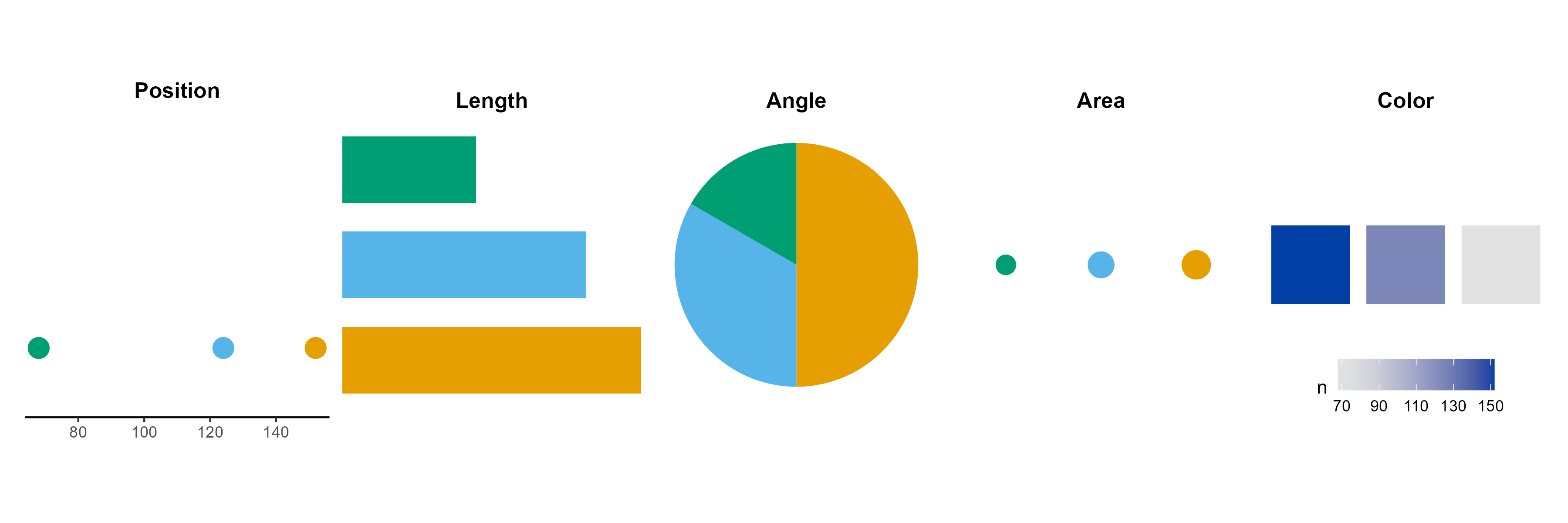
- Accuracy of judgement decreases from left to right
- More accurate judgements vs. more generic judgements
Different channels - different accuracy
- Combine multiple channels for more accuracy
- Add numbers to increase accuracy of judgement

Arrange your plot
Arrange your plot so that it’s easy to extract the main message

Choose a good plot type
Different plot types tell different stories

Keep it simple
Don’t overcomplicate your figures and bury your message
What is the main message here?

Keep it simple
Message: Life expectancy and GDP differences in the world

Consider the trip
A story about the GDP China and India

Rotate your plot
Reading labels upside down is a neck rotation - very annoying

Highlight the main message
Highlight focus contries, de-emphasize all others

Highlight the main message
Highlight focus contries, de-emphasize all others

Order your data
Order categories consciously not automatically.

Order your data
Order categories consciously not automatically.

The importance of differences
Use differences to communicate not to decorate

Declutter your graphs

Element size
- Make sure your elements are big enough
Text size, Linewidth, Point size - Depends on the context

Contrast
Make sure that the contrast is high enough
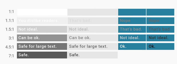
- Use tools to check contrast, e.g.
https://snook.ca/technical/colour_contrast
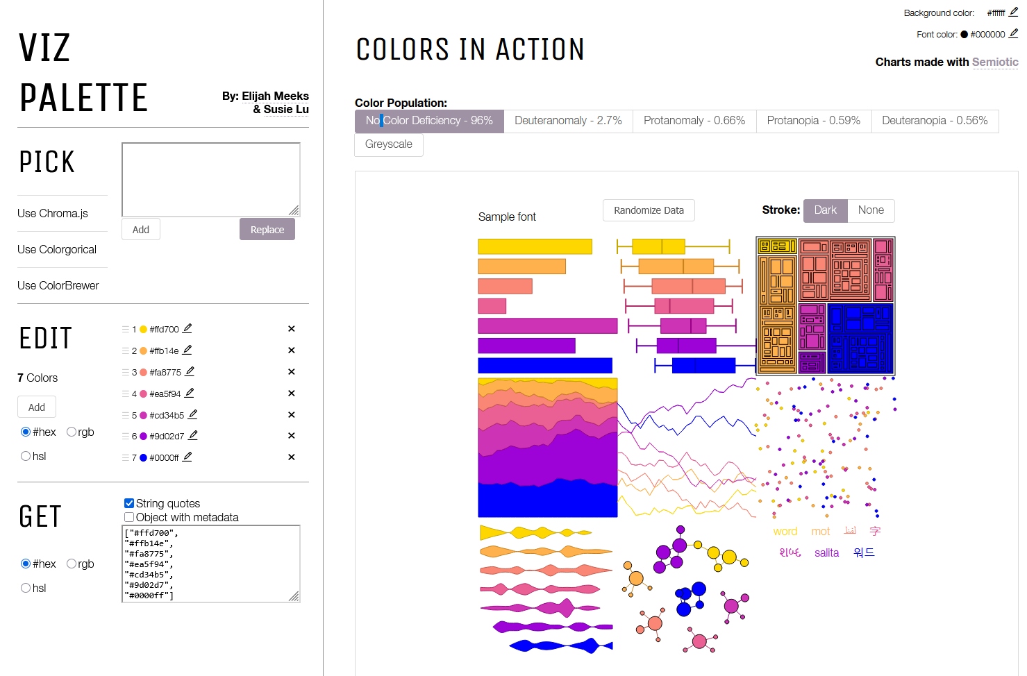
Color
Use logical/intuitive colors
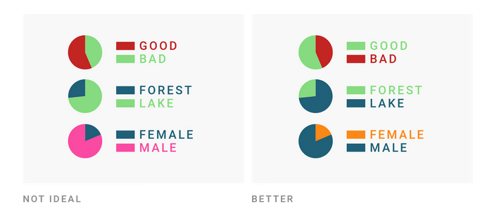
Color
Choose colorblind friendly palettes (if in doubt: test!).
Add redundancy
Redundancy increases the chance that everyone can see the difference!