palmerpenguins in your documentWe will now include some analysis of the penguins data in the document.
As with “normal” R code, you need to load the palmerpenguins package in your
document in the beginning.
A convenient location to load packages is the setup code chunk.
Just add library(palmerpenguins) as a line in this chunk.
You can always come back to the setup chunk and add all the packages that you need in
your analysis. Then you have all the library() calls in one place.
Now add some R code that produces different types of output in the document.
The output types we will include using the penguin data set are:
For each output type, go through the following steps:
Code -> Insert Chunk orCtrl/Cmd + Alt/Option + IBelow, you find example code for a figure and a table. For now, just copy my code to your R chunk. If you still have time in the end, change the code or write new code chunks yourself for different types of output.
Don’t forget to knit your document often to detect errors early on.
I use ggplot2 to produce the figures, so don’t forget to load the package in the setup
chunk.
Choose one of the two figure ideas from below:
ggplot(penguins, aes(x = body_mass_g, fill = species)) +
  geom_histogram(alpha = 0.6) +
   scale_fill_manual(values = c("darkorange", "purple", "cyan4")) +
theme_minimal()ggplot(
data = penguins,
aes(
x = bill_length_mm,
y = bill_depth_mm,
color = species,
shape = species
)
) +
geom_point(size = 3, alpha = 0.8) +
geom_smooth(method = "lm", se = FALSE) +
scale_color_manual(values = c("darkorange", "purple", "cyan4")) +
theme_minimal()I use the dplyr package here, so don’t forget to load it in the setup chunk.
Create a summary table of the mean variable values grouped by penguin species and sex.
Add some sentences to the document that use R code to report numbers.
You can start with the example below. If you still have time in the end, you can add more sentences:
Now modify some of the code chunk behaviour using chunk options.
Start with the chunk that produces the figure:
fig.width and fig.height or out.widthKnit the document and look at the output.
Now think of some global chunk options that might make sense for your document.
Add these options to the knitr options in the setup chunk.
You can for example think of things like:
Get creative. Add new code chunks that produced different types of output. Find some ideas below:
Can you report the number of penguins and their body mass separately for the three penguin species?
Hint: Calculate the mean weight of the penguin species in a separate code chunk and save them in 3 variables. Then you can use these variables in the inline code.
knitr::include_graphics()Include the penguin illustration from within a code chunk instead of with ![]().
This will allow you to make it a smaller so the document looks nicer. To do so
Right Click -> Save image as). Save it in the same location as your .Rmd document.Careful because this only works with HTML output and will give you an error for
pdf and word output.
You can use the plotly package to include an interactive plot in your document.
To turn a “normal” plot into an interactive plot you just need the following steps:
install.packages("plotly")ggplotly() functionBelow you find an example. You can do the same now for one of the plots that you already have in your document.
# Make the plot and save it in a variable
my_boxplot <- ggplot(
  data = penguins,
  aes(
    y = bill_depth_mm,
    fill = species,
    x = species
  )
) +
  geom_boxplot()+
  scale_fill_manual(values = c("darkorange", "purple", "cyan4")) +
  theme_minimal()

# Turn the plot interactive
plotly::ggplotly(my_boxplot)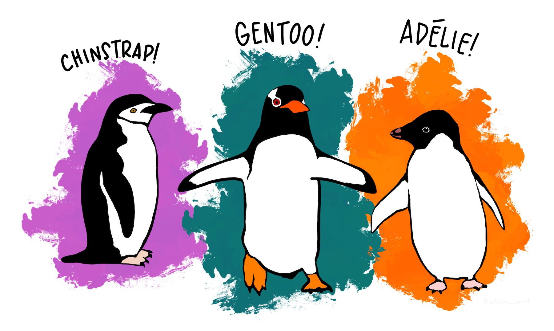